As I started reading about ebook design, I kept coming across one piece of advice, repeated in various forms: Don’t design your own cover. However, since I’m just experimenting and with short stories no less, I was unwilling to pay anyone to design a cover for an ebook that might not even sell. Looking around for alternatives, I found William King’s post about using PowerPoint to design covers, so I decided to give it a try. Once again, I ran into the issue of money; I didn’t want to pay for an image/photo to use as cover art. I looked around on some free photo sites, but I didn’t find anything I thought I could use. So, I decided to be creative. Here’s how I put together the covers for “Racing the Sand” (RtS) and “Konstantin” (K):
(All of the following directions are for Microsoft PowerPoint 2007)
Size:
Before I started, I made the slide size 6×9 inches (Design> Page Setup). I had to increase the size later on, but I noticed that if I made it bigger in PowerPoint, some of the effects became smaller and less noticeable. I decided to design it as a small image, save it as a PNG file (Save As> Other Formats> PNG), open it in Paint and resize it to the required number of pixels. As far as I can see, this method maintains a fairly crisp image (or as crisp as it needs to be in its life as an ebook cover/thumbnail).
Background:
RtS: I took a picture of one of my belts, copied the picture in another program until I had three images side by side with the one in the middle a bit narrower than the other two. I saved the final product and made it the background of my PowerPoint slide (Right click on slide> Format Background…> Fill> Picture or texture fill> Insert from File).
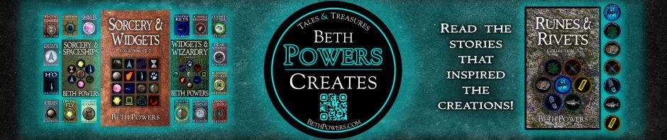
K: I took a picture of the side of a metal mixing bowl and used Paint to cut a smaller rectangle from the picture. After saving the smaller picture, I made it the background of my PowerPoint slide (Right click on slide> Format Background…> Fill> Picture or texture fill> Insert from File) and recolored it dark blue (Right click on slide> Format Background…> Picture> Recolor)
Text:
Choosing a font was trickier than I had expected, and not just because I had to decide what would look good—apparently, fonts are only licensed by their designers for certain things (and you would have to obtain permission for other uses). After reading several pages about the use of fonts, I’m still not sure I understand everything, but fontsquirrel.com was recommended for free fonts (they also include a copy of the license, so you can read for yourself whether or not it can be used as you want to use it), which was where I downloaded the font Immortal to use for my covers.
RtS: I just made the text white and wrote in a text box, although I ended up making a separate text box for each word in the title, so that I could control the spacing. When I had everything arranged, I went to Format> Text Effects> Bevel> Soft Round for a bit of depth and Format> Text Effects> Glow> More Glow Colors> Black to get the dark shadow that makes the text appear raised from the background (this was suggested by William King in the post that I linked above).
K: This one had its own challenges—adjusting the font size only made the title text seem too short, and there is no way (that I can find) to stretch text in PowerPoint; however, you can stretch images. I used another program, filled the background black, and typed the title in white text. After saving that as an image, I inserted it into my PowerPoint cover and could stretch it to the desired height and width. I had to get rid of the black around the text (Format> Recolor> Set Transparent Color> Click on the color to be turned invisible), and I could still add the black glow like I did with “Racing the Sand” (Format> Text Effects> Glow> More Glow Colors> Black). I did the same thing with my name on this one because it allowed me to make it slightly bigger. The only effect that I had to drop was the Bevel because it doesn’t work on images, but I don’t really think the difference is noticeable.
Images:
As mentioned above, I didn’t want to pay for a picture to put on my cover, so I browsed sci-fi and fantasy covers for ideas that didn’t include people or scenes. I came across several fantasy covers that had some sort of shield or disk shape in the middle and little else, which seemed like a doable format, especially since I was already considering using an hourglass for “Racing the Sand.”
RtS: After experimenting with several different pictures, I used a chrome filter from an old version of Photoshop on the belt picture (the one I used for the background) and cut out a circle for the disk, which I copied into the PowerPoint cover. Next, I inserted a black circle (Insert> Shapes> Oval) and filled it with the belt picture (Right Click> Format Picture> Fill> Picture or texture fill> Insert from: File…). I set it to 32% transparent (Right Click> Format Picture> Fill> Transparency), which gave it the wavy look as a result of the rest of the disk showing through. The hourglass is a picture of an actual hourglass taken by my sister and run through the same chrome filter as the disk. With the hourglass and the disk, I added a black glow to make them stand out (Format> Picture Effects> Glow> More Glow Colors> Black).
K: For the disk, I used a picture of a typewriter key (the one that is my user picture on here) run through the chrome filter and zoomed in to avoid the actual letter showing up. I inserted a black circle (Insert> Shapes> Oval), filled it with another piece of the key picture (Right click> Format Picture> Fill> Picture or texture fill> Insert from: File…), and recolored it light blue (Right click> Format Picture> Picture> Recolor). For the triangle, I ran a picture of the typebars of a typewriter (similar to my [old] Facebook cover photo) through the chrome filter and used the Photoshop shape tool to cut out the arrow shaped image, which I then pasted into the PowerPoint cover. I recolored the picture a slightly brighter dark blue (Right click> Format Picture> Picture> Recolor) and added an interior shadow (Right click> Format Picture> Shadow> Presets> Inside Center and Blur to desired darkness). I also added the same glow on the disk and the triangle (Format> Picture Effects> Glow> More Glow Colors> Black—Dark Blue for the triangle).
So, no, I don’t think you have to pay someone else to design a halfway decent cover for your ebook, but of course, it all depends on how much time you want to put into learning how to do things you never thought you could do with programs you already have and tinkering until you get a satisfactory result. But just to expand the alternatives for cover design that are out there, I thought I would share how I made two ebook covers without buying anything by using free fonts, random pictures I took myself, and programs I already had.


![my [old] Facebook cover photo](https://scontent-atl3-1.xx.fbcdn.net/v/t1.0-9/67980_396252383799584_660168592_n.jpg?oh=d11baa8a805f0e8946b0d6c6f562aeb9&oe=58766EB9)